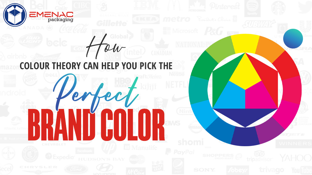
How Colour Theory Can Help You Pick the Perfect Brand Colors

If you think colors just increase the appealing look of the packaging, you need a second thought. In branding, marketing, and making your product attentive to markets, color theory matters a lot. It all depends on your color choice, how your packaging looks, and how the images reflect your brand theme.
Color palettes are not only an important factor in business branding but also create a sense of emotions that influence the consumer’s behavior. Let’s dive into the theory of colors and learn how to pick the perfect colors for your brand, in this complete blog post.
Basic Color Theory_ You Need to Know
Without any doubt, Colors have an influential effect on anything on earth. Yes, whether it’s about lifestyle, nature, business marketing, or even packaging. Colors have their own special place to give a product an exceptional touch of amazement. Remember, colors can be your most powerful element in packaging design if you use them efficiently.
When it comes to colors, you just need to know about basic color theory. what’s that?
In simple words, color theory is a blend of colors that are used in a design via contrasting multiple colors. After all, color theory is.
“Colors theory is the study of how colors work to create a design and affect people’s emotions, experiencing the unique design”
The Color wheel
- Primary Color: There are three primary colors red, yellow, and blue.
- Secondary Colors: Secondary colors are also three green, orange, and purple.
- Tertiary Colors: Tertiary colors are created with a combination of primary and secondary colors.
Why Colors Are Important for Branding?
Colors play a vital role in increasing the apparent value of the product. In the packaging industry, bold and bright colors are used for interactions, art, and marketing to set your brand apart from the rest.
Here are some reasons why colors are crucial for packaging:
Colors Are Important for Consistent Branding
Colors count to develop consistent brand packaging. Consistency of the brand ensures customers that they are connected with the reputable brand and increase their loyalty. Regular color helps customers to recognize your brand product on retail shelves.
Highlight Your Logo
Your logo is your brand identity. So, it is important to consider which colors are used and how. Minimal colors make your logo effective and attentive. More color combinations can mess up your logo design and make it dull.
Change The Brand Perception
Want to add fun, excitement, innovation, emotions, and vibrancy to your packaging design? Well, nothing else but the blend of lively colors can make it possible.
Influence The Consumer Behavior
Some colors provoke emotions and feelings. They play an effective role in influencing consumers’ behavior and catering to brand requirements.
The Psychology Behind Applying Your Brand Color
Have you ever wondered, why well-known brands are consistent in their packaging design, color, material, and marketing tools? Well, it’s all about implementing color theory, which they use to create a powerful connection with buyers. Understanding the psychology behind the colors and how they influence consumer behaviors is important when it comes to branding or marketing. Color psychology reflects how different hues affect people’s emotions and actions.
Successful Brands and Their Color Psychology
- Apple: Use black and white
- Coca-Cola: Red and White
- McDonald’s_ Red and Yellow
- Cadbury Chocolate_ Purple
- BBC news channel _ Black
Consider The Color Scheme of Competitors
When using color psychology, considering the color schemes of competitors is also a crucial factor. Ever thought about what you do if your brand color matched with competitors? It’s really a major thing to consider. So, to prevent these issues select branding points like textures, colors, fonts, and design styles that totally align with your brand personality.
How Can You Choose the Right Color for Your Brand Identity?
Looking for a way how can you choose the right color for your brand identity? Well, no need to worry, you are in luck! The following tips help you to choose the right colors for your brand that not only look great but also make the brand recognizable. The packaging industry uses many tools to set your brand apart and win the loyalty of customers. Your brand identity means the colors of your logo, packaging, slogan, text style, and overall design.
Tips to Choose the Best Brand Colors for Logos
- Understand color psychology
- Learn about the color theory
- Consider your previous brand colors
- Choose any three or four bold colors
- Follow the color wheel
- Opt for your color variants
- Use according to brand theme
Bottom line
In the packaging industry, understanding color theory and the efficient use of the color wheel is important to create a sense of exclusivity. Colors are signs of emotions, action, fun, feelings, and innovation. Whether you want to use primary or secondary colors for a minimal packaging design or give your packaging a flawless look with tertiary color. Endless color blends are available; you just need to learn how to use them efficiently.