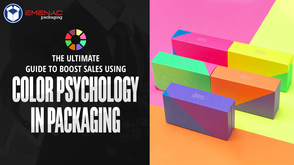
The Ultimate Guide to Boost Sales Using Color Psychology in Packaging

Colors play a significant role in our lives. Throughout centuries colors have held exemplary symbolism in many cultures and regions all over the world. When one first lays eyes on a package, the color is what captures the attention primarily. Using Color Psychology while designing custom print packaging can prove to be a very effective marketing strategy. In this blog, we will look into how we can use different colors in our packaging to generate a bigger market.
Colors for Food Packaging:
The best color combination for food packaging is red and yellow. It has been scientifically proven that the sight of the color red alleviates one’s heartbeat and the color yellow kick-starts human metabolism. The color red is also an attention grabber, and combined with the color yellow, it creates such a situation in which endorphins are released, in turn inducing hunger. These colors are the best choice for food packaging. The colors blue, pink, grey, and brown are the colors that make a person lose appetite and thus should be avoided when making a choice for colors in food packaging.
Colors for Skin Care Product Packaging:
A wide range of colors can be used when designing packaging for skin care products in accordance with product functionality. When designing packaging for products that cleanse, white tends to be the excellent choice as a base color for it gives off a sense of purity and cleanliness. For products that are used before sleep time, like Night Creams and Sleep Masks, pastel tones of blue work best as these shades create a cool yet calming ambiance. For products that are organic, the color brown of craft papers and shades of green work best. When designing packaging for products that fight skin care issues like acne or scarring, a combination of Red or Blue over white base works wonders!
Colors for Farm Produce Packaging:
When picking colors for the packaging of Farm Produce like fresh vegetables or fruits, it is best to stick with earthy tones, like the shades of the colors brown and green. These shades exude an organic vibe and give the customer a feel of freshness just by looking at the packaging.
Colors for Packaging of products for Children:
When designing packaging for products where the target audience is children, specifically toddlers, and in turn their guardians, the superlative choice of colors should be brighter shades or any color. Pastels are usually a poor shade of choice when designing packaging for children’s products, so are dull earthy tones. The brighter the color of the packaging of a toy or candy, the more likely is it to attract a toddler’s attention to your product, and that can really boost sales!
Colors for Packaging of Luxury Items:
If you are willing to design packaging for luxury products, for example, jewelry, the color purple is an outstanding choice. The color purple is a very sensible choice for items that are purchased by adults as it gives off a feeling of sophistication and royalty. Black is also a very appropriate choice when designing packaging for high-quality products because it is a color that evokes class and refinement.
Conclusion:
To conclude, we can safely declare that the choice of colors when designing the packaging of your products can be a crucial choice that may alleviate or aggravate your target market. So if your brand needs great packaging that enhances the market of your product, introducing Color Psychology in Packaging can do that for you and you can always trust Emenac Packaging to help you with the best packaging solutions.